Arena Cowork

When Allôhire approached Rustand & Co to develop the brand for Arena Cowork, the objective was clear: create an identity that could stand on its own while remaining connected to the philosophy that helped inspire it.
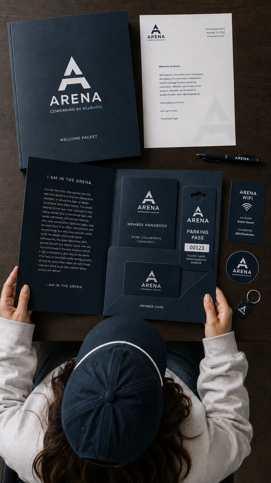
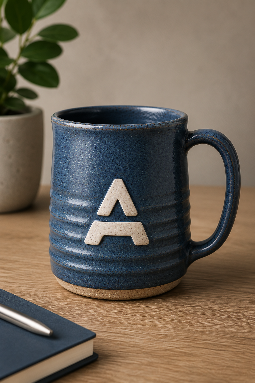
At the heart of Allôhire is the idea of being other-centered. Even the brand itself reflects that belief through the use of the caret symbol, a subtle visual element that represents elevating and serving others. As we began exploring the identity for Arena, we saw an opportunity to carry that meaning forward rather than start from scratch.
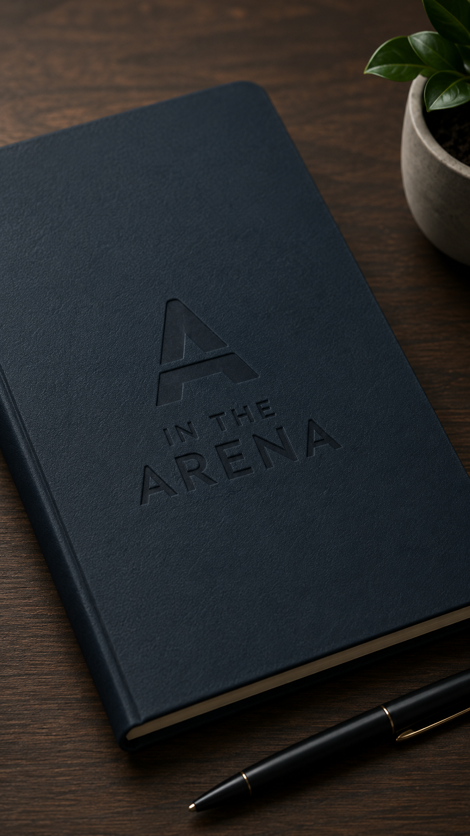
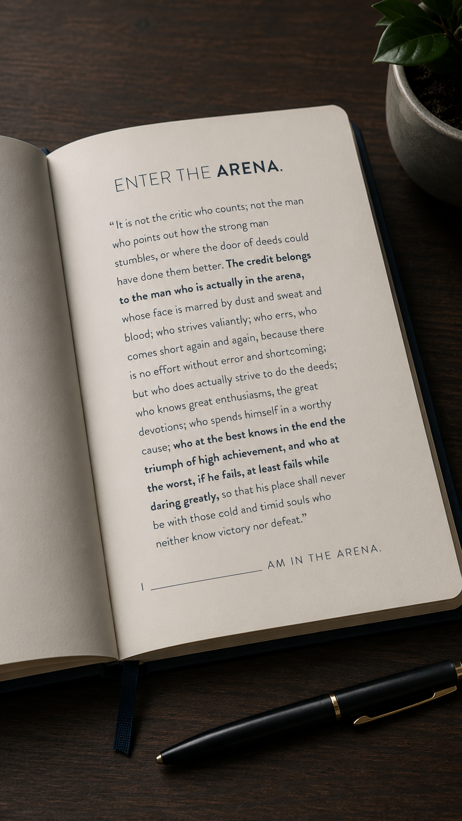
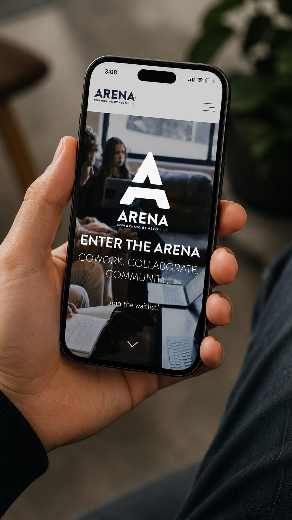
At the same time, Arena Cowork draws its name and inspiration from Theodore Roosevelt's famous "Man in the Arena" speech. The vision was not simply to create another coworking space, but to create a place for entrepreneurs, founders, creators, and leaders actively building something meaningful. People willing to take risks, put their work into the world, and step into the arena rather than watch from the sidelines.
The challenge was finding a way to visually connect those two ideas.
The solution emerged through the Arena wordmark itself. By incorporating the caret symbol into the apex of the "A," we created a direct link to Allôhire's other-centered philosophy while establishing a distinctive identity for Arena. What appears to be a simple geometric detail carries deeper meaning, a reminder that even in the pursuit of ambitious goals, success is rarely achieved alone.
From there, we developed a stronger, more structured visual system inspired by the idea of an arena itself. The mark takes on a confident, almost steel-like character that evokes performance, competition, resilience, and growth. Combined with the same grotesque typeface family used throughout the Allôhire brand system, Arena feels both familiar and independent, a natural extension of its roots with a voice entirely its own.
The result is more than a logo. It's a symbol of two beliefs coming together: be other-centered, and get in the arena.